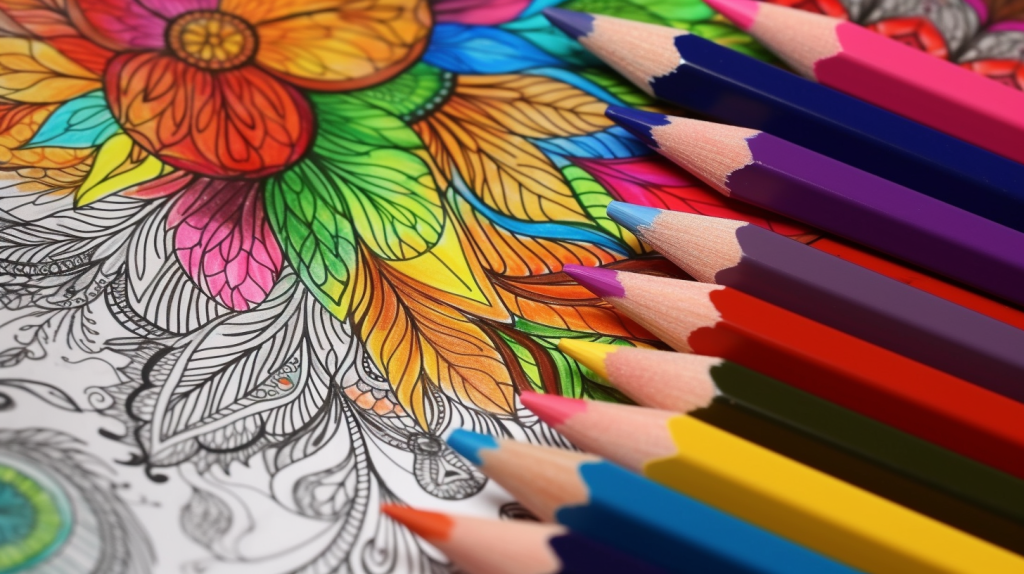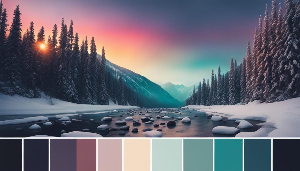
Creating your own custom coloring palette can take your artwork to the next level. With a personalized palette, you can bring your unique style and preferences to life through vibrant and beautifully curated shades. In this color palette tutorial, we will guide you through the process step by step, making it easy for you to craft a custom palette that reflects your artistic vision and enhances your coloring experience.
Key Takeaways:
- Create a personalized color palette to add a personal touch to your artwork
- Understanding color theory helps in choosing colors that work harmoniously together
- Start by choosing a base color that sets the tone for your palette
- Explore shades and tints of your base color to create depth and dimension
- Add variation to your palette by introducing different hues
Understanding Color Theory
Before you start creating your own color palette, it’s important to have a basic understanding of color theory. Colors have different properties, such as hue, value, and saturation, which can influence how they work together. By learning about color harmony and different color combinations, you’ll be able to choose colors that complement each other and create visually appealing color palettes for your coloring projects.
Color theory is the study of how colors interact and how they can be combined to create pleasing visual effects. It provides the foundation for understanding how colors work together and how they can be used effectively in art and design.
| Color Property | Description |
|---|---|
| Hue | The pure, basic color of an object, such as red, blue, or yellow. |
| Value | The lightness or darkness of a color. A value of 0 is black, and a value of 100 is white. |
| Saturation | The intensity or purity of a color. A highly saturated color appears vivid, while a desaturated color appears muted. |
Color harmony refers to the relationship between colors in a palette. There are various color harmony principles, such as complementary, analogous, and triadic, that can guide your color choices. These principles help ensure that the colors in your palette work together harmoniously and create a balanced visual composition.
To create visually appealing color combinations, you can consider the following color schemes:
- Analogous: Colors that are adjacent to each other on the color wheel, such as blue, blue-green, and green.
- Complementary: Colors that are opposite to each other on the color wheel, such as red and green, blue and orange.
- Triadic: Colors that are evenly spaced on the color wheel, such as red, yellow, and blue.
- Monochromatic: Different shades and tints of a single color.
By understanding color theory and exploring different color harmonies and combinations, you can create visually stunning and harmonious color palettes for your coloring projects.
Choosing Your Base Color
The first step in creating your own color palette is choosing a base color. This is the main color that will set the tone for your entire palette. When selecting your base color, consider your personal preferences and the mood you want to convey in your coloring. You can start with a color that you love or one that matches the theme of your coloring project. However, it’s important to keep in mind that the base color should not be too dark or too saturated.
By choosing a base color that is neither too dark nor too saturated, you allow yourself room to play with different shades and tints later in the process. This will give your color palette more flexibility and make it easier to create harmonious combinations. Consider the following tips when selecting your base color:
- Consider the overall theme or subject matter of your coloring project.
- Think about the emotions and feelings you want your coloring to evoke.
- Take into account your personal color preferences and what colors you find visually appealing.
- Experiment with different shades and tints of your chosen base color to see how they work together.
Color Selection Tips
When choosing your base color, keep these color selection tips in mind:
Tip 1: Choose a base color that complements the subject matter of your coloring project. For example, if you’re coloring a nature scene, consider using a base color inspired by the colors of the natural environment.
Tip 2: Take inspiration from color palettes you find attractive in other artwork or in nature. Look for colors that catch your eye and make you feel something.
Tip 3: Consider the psychological and emotional effects of colors. Different colors can evoke different moods and feelings, so choose a base color that aligns with the overall atmosphere you want to create.
| Color | Description |
|---|---|
| Red | Passionate and energetic |
| Blue | Calm and soothing |
| Yellow | Happy and cheerful |
| Green | Fresh and natural |
Remember, choosing the right base color is the foundation for creating a harmonious and visually appealing color palette. Take your time to explore different options and trust your instincts. Once you have your base color, you can move on to exploring shades and tints to add depth and variation to your palette.
Exploring Shades and Tints
Once you have selected your base color, it’s time to dive into the fascinating world of shades and tints. Shades are darker versions of your base color, while tints are lighter versions. By leveraging shades and tints, you can add depth and dimension to your color palette, creating visually striking artwork.
Experimenting with different levels of saturation and brightness allows you to find the perfect shades and tints that complement your base color. This process helps in creating a balanced and harmonious color scheme that elevates your coloring projects.
Imagine the possibilities of blending different shades and tints! By skillfully combining them, you can achieve captivating effects and captivating contrasts. Let your creativity flow as you explore the various shades and tints available to you.
Remember, shades and tints play a vital role in enhancing your color palette, adding richness and complexity to your artwork. They provide the opportunity to create shading, highlights, and gradients, making your coloring projects come alive.
Adding Variation with Hues
To add more variation to your custom color palette, you can introduce different hues. A hue refers to a specific color on the color wheel. By changing the hue while following the arc of shades and tints, you can create an analogous color harmony. This means that colors that are next to each other on the color wheel will work together harmoniously.
Experimenting with different hues allows you to create unique and dynamic color combinations for your coloring projects. By incorporating a range of hues into your palette, you can add depth, interest, and visual appeal to your artwork.
Try using colors that are adjacent to your base color on the color wheel to create a cohesive and balanced palette. This approach can result in a pleasing and harmonious composition. However, don’t be afraid to explore colors from different parts of the color wheel for more daring and contrasting combinations.
Remember, the key to successfully incorporating hues into your color palette is experimentation. The more you play with different colors and combinations, the better you will understand how they work together. Allow yourself to be inspired and let your creativity guide you in selecting the perfect hues for your custom palette.
Next, let’s explore how adjusting the values of your colors can further enhance your custom color palette.

Adjusting Values for Balance
Another way to enhance your color palette is by adjusting the values of your colors. Values refer to the lightness or darkness of a color. By creating tints that are lighter and less saturated and shades that are darker and more saturated, you can create a balanced palette with a gradient of light to dark. This will add depth and dimension to your coloring and make your artwork more visually appealing.
Color Selection Tips
When adjusting the values of your colors, keep these tips in mind:
- Start with your base color and experiment with lighter and darker shades of it.
- Consider the mood and atmosphere you want to convey in your artwork.
- Use lighter tints to highlight certain elements and create contrast.
- Use darker shades to add depth and create shadows.
- Play around with the saturation of your colors to achieve the desired effect.
“By adjusting the values of your colors, you can create a sense of balance and harmony in your artwork. It’s like playing with light and shadow, adding depth and dimension to your coloring.”
Sample Color Value Adjustment
| Color | Original Value | Adjusted Value |
|---|---|---|
| Red | #FF0000 | #660000 |
| Blue | #0000FF | #000033 |
| Yellow | #FFFF00 | #999900 |
By adjusting the values of the colors in the sample palette, you can see how the original vibrant colors transform into darker and more saturated shades. This adjustment adds balance and creates a more visually appealing color palette.
By adjusting the values of your colors, you can take your color palette to the next level, creating a harmonious and balanced composition in your artwork. Experiment with different value adjustments and explore the impact they have on your coloring projects. Remember, adjusting values is just one aspect of color selection, so continue refining your color palette by incorporating other techniques and ideas.
Pairing Colors for Your Palette
Now that you have a range of beautiful colors in your custom color palette, it’s time to unleash your creativity by pairing them together. The art of combining colors is essential to create stunning and impactful coloring pieces. Whether you prefer bold and vibrant looks or more understated and harmonious combinations, the way you pair colors can drastically impact the overall feel and visual appeal of your artwork.
When selecting color combinations, consider the contrast between the colors. Contrast can create a captivating visual effect and make certain colors pop. For example, pairing a deep blue with a vibrant yellow will create a striking and lively contrast. On the other hand, combining similar shades of blue and green can produce a soothing and harmonious effect.
While there are no strict rules when it comes to color pairing, it’s helpful to familiarize yourself with color harmonies and popular color combinations. The color wheel is an excellent tool to guide you in creating complementary, analogous, or triadic color schemes.
It’s important to experiment and find the combination that speaks to your unique artistic vision. Keep in mind that different colors evoke different emotions, so think about the mood and atmosphere you want to convey through your coloring.
Experiment with different pairings until you find the perfect mix of colors that work well together. The possibilities are endless, and the more you play with different color combinations, the more you’ll develop your own sense of style and color intuition.
Using Color Overlays for Enhancement
To take your color palette to the next level, you can add color overlays. Color overlays are additional layers of color that can be applied to your existing palette to create new and unique effects. By using blending modes and adjusting opacity, you can create a cohesive look and tie all the colors in your palette together. Color overlays can be used to create themes or add extra depth and interest to your coloring.
Color overlays are a versatile technique that allows you to enhance your color palette and create dynamic visual effects. With just a few simple steps, you can transform your artwork and give it a professional touch.
Steps to Add Color Overlays:
- Selecting an Overlay Color: Choose a color that complements your existing palette and adds the desired effect. Consider the mood and theme of your artwork when making your selection.
- Applying the Overlay: Create a new layer in your digital art software or use a transparent sheet if coloring traditionally. Fill the layer or sheet with your chosen overlay color.
- Adjusting Blending Modes: Experiment with different blending modes to achieve the desired effect. Blending modes determine how the overlay color interacts with the underlying colors in your artwork.
- Tweaking the Opacity: Adjust the opacity of the overlay layer to control the intensity of the effect. Lower opacity values create subtler overlays, while higher values result in more pronounced effects.
- Refining and Fine-Tuning: Use erasers or masking techniques to selectively apply the overlay color to specific areas of your artwork. This allows you to create focal points or highlights that enhance the overall composition.
By following these steps, you can experiment with color overlays and unlock endless possibilities for enhancing your color palette. Whether you want to add a dreamy glow, a dramatic flair, or a touch of whimsy, color overlays can elevate your artwork to new heights.
Add color overlays to your custom color palette and watch as your artwork comes to life with vibrant and captivating colors.
Next, we’ll explore how to effectively apply your custom color palette to your coloring projects. Stay tuned for more tips and techniques!
Applying Your Custom Color Palette
Now that you have created your own custom color palette, it’s time to unleash your creativity and apply it to your coloring projects. Whether you prefer using colored pencils, markers, or digital coloring tools, your personalized color palette will guide you in selecting the perfect shades that best represent your unique style and artistic vision.
Here are some tips to help you make the most out of your custom color palette:
- Start with the base color: Begin by identifying the base color in your palette. This will be the main color that sets the tone for your artwork. Refer to your palette and select the base color that best suits your coloring project.
- Experiment with different combinations: Don’t be afraid to mix and match colors from your palette. Explore various combinations to create interesting and harmonious effects in your artwork. Embrace the versatility of your custom palette and let your imagination guide you.
- Consider color psychology: Keep in mind that different colors evoke different emotions and moods. Think about the message you want to convey through your coloring and choose colors from your palette that align with that vision. For example, warm colors like red and orange can evoke feelings of energy and excitement, while cool colors like blue and green can create a sense of calmness and serenity.
- Highlight focal points: To create visual interest in your artwork, use colors from your custom palette to highlight focal points or add emphasis to certain areas. This can help draw the viewer’s attention and bring depth to your coloring.
- Blend and layer colors: Experiment with blending and layering colors from your palette to create unique shades and gradients. This technique can add depth and dimension to your artwork, making it more visually appealing.
Remember, your custom color palette is a reflection of your personal style and artistic voice. Embrace the freedom it offers and let it inspire and guide your coloring journey.
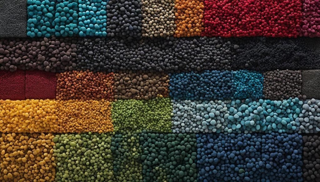
With your custom color palette, you have the power to create artwork that is truly one-of-a-kind. So grab your coloring tools, refer to your palette, and let your imagination soar. Happy coloring!
Conclusion
Creating your own custom color palette for coloring is a fun and rewarding experience. By following the step-by-step tutorial provided in this guide, you can craft a unique and personalized palette that enhances your coloring projects. Experimenting with different colors, shades, and tints will allow you to create stunning artwork that truly represents your style and vision.
Remember to always consider the principles of color theory when selecting and combining colors. Understanding how colors work together can help you achieve a harmonious and visually appealing palette. Whether you’re using colored pencils, markers, or digital coloring tools, having a personalized color palette will provide you with a solid foundation to create artwork that stands out.
So go ahead and let your creativity soar! Take inspiration from the world around you and apply it to your custom color palette. With each stroke of color, you’ll be able to bring your imagination to life and create artwork that is truly one-of-a-kind. Happy coloring!
FAQ
What is a custom coloring palette?
A custom coloring palette is a collection of colors that you choose and create to use in your coloring projects. It adds a personal touch and allows you to express your unique style and preferences.
Why is color theory important for creating a color palette?
Color theory is important because it helps you understand how colors work together. By learning about color harmony and different color combinations, you can create visually appealing and harmonious color palettes for your coloring projects.
How do I choose a base color for my palette?
To choose a base color for your palette, consider your personal preferences and the mood you want to convey in your coloring. You can start with a color that you love or one that matches the theme of your project. Avoid selecting colors that are too dark or too saturated, as you’ll want room to play with different shades and tints later in the process.
What are shades and tints?
Shades are darker versions of a color, while tints are lighter versions. By using shades and tints of your base color, you can create depth and dimension in your color palette. Experiment with different levels of saturation and brightness to find the perfect shades and tints that complement your base color.
How can I add variation to my color palette with hues?
To add variation to your color palette with hues, change the hue while following the arc of shades and tints. This creates an analogous color harmony, where colors that are next to each other on the color wheel work together harmoniously. Experiment with different hues to create unique and dynamic color combinations in your palette.
What does adjusting values mean?
Adjusting values refers to the lightness or darkness of a color. By creating tints that are lighter and less saturated and shades that are darker and more saturated, you can create a balanced palette with a gradient of light to dark. This adds depth and dimension to your coloring and makes your artwork more visually appealing.
How do I pair colors in my palette?
To pair colors in your palette, consider the contrast between the colors and think about the overall look and feel you want to achieve in your coloring. You can choose contrasting colors for a bold and vibrant look or opt for more subtle and harmonious combinations. Experiment with different pairings until you find the perfect mix of colors that work well together.
What are color overlays and how can I use them?
Color overlays are additional layers of color that can be applied to your existing palette to create new and unique effects. By using blending modes and adjusting opacity, you can create a cohesive look and tie all the colors in your palette together. Color overlays can be used to create themes or add extra depth and interest to your coloring.
How do I apply my custom color palette to my coloring projects?
To apply your custom color palette to your coloring projects, refer to your palette when selecting colors. Whether you’re using colored pencils, markers, or digital coloring tools, choose the colors that best represent your style and vision. Having a personalized color palette will help you create cohesive and harmonious artwork that reflects your unique artistic voice.
How can creating a custom color palette enhance my coloring experience?
Creating a custom color palette enhances your coloring experience by allowing you to express your personal style and preferences. It adds a personal touch to your artwork and helps you create cohesive and visually appealing coloring projects. With your own custom color palette, you can create stunning and unique shades that make your artwork truly one-of-a-kind.

